


Group Project
Our majors are: Strategic Communication, German, and Art History.
He propose to research and present how historical artistic elements have transitioned into modern German advertisements or New Media.
Question?
How large of a return to companies see on the enormous amount of money the spend on Super Bowl advertisements?
Response 05
This reading was interesting to me because I read it from a strategic communication major’s point of view with the added perspective of a design minor. The concepts of design, art, typography, and layout are all relevant to me.
Tie as interesting to see how Tufte presented the subconscious implications of charts or other media. The colors, lines, and spacing (location) of adverts or other media are all strategically placed. The human eye and mind have been conditioned to understand the implicit placement, and the relationship between the natural interaction and the placement is direct.

Leading Lines are also large parts of other media.
(http://0.tqn.com/d/create/1/0/E/u/F/-/Entry-1-Leading-Lines-1000.jpg)
Photography would be an example of that. Although I understand that it is not a direct line, the lines in the image above still guide the eye through the image, much like Tufte’s arrows.
Reading Response 04.
Response 04
The first reading we jumped into was about Tufte’s Spark Lines. I honestly had mixed feelings about this reading. While u understand that Sparklines are a means of presenting information, feel that they are not as effective as Tufte claims. I think that Spark Lines are most likely much more effective if the author is simply trying to convey general meaning, specifically with the line graph examples for glucose.
When Tufte presented the Whisker Diagrams and gave the baseball examples, I was more skeptical if the detail. In my opinion, larger graphics would do a much better job. Instead, I had to read a ledger just to try to understand what the graphs were saying, then squint to see the details that Tufte outlined. As a reader, I would much rather see large-scale graphics that help me interpret the data.
I would much rather see data presented like this:
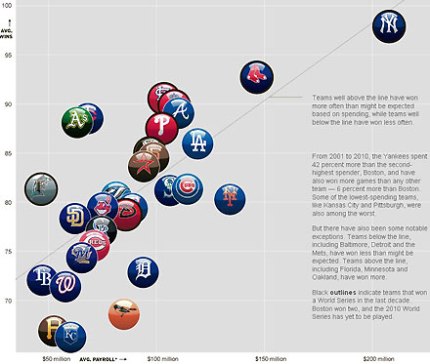
(http://misterirrelevant.com/wp-content/uploads/2010/09/MLB-Chart.jpg)
The we feel fine website was kind of a pain, I think it was a cool idea, and had some interesting interactions, but I was not inspired to take the time to analyze each thing. I’m not sure what their direct message, or mission is (if they have one) the site felt a little busy with all the colors dashing around. I see that it can relate back to the sparklines as alternates graphics to deliver date creatively.
The “snake oil” piece was really cool. It was a fun interaction with some relevant info. I had a good time interacting with the site, and learning a little bit about what I can be doing to rehab my shoulder a little bit better. My girlfriend saw me on the site, and disagreed with some of the information, which made me wonder where they got their sources, but then again, what does she know?
Reading Response 03.
The first Tufte chapter made sense to me, but there were some points I do not agree with. There were points throughout the chapter were Tufte spoke in absolutes, and I am not sure there is an equation for mapping images. While I do concede there are certain types of images where mapping becoming extremely important (scientific images immediately come to mind) I feel like there is more need for indirect mapping.
I feel like strategically placed text that is not as direct is used all the time. Tufte touched on “Minimal Mapping”. I feel like every day images use this all the time. A lot of advertisements or everyday images use minimal mapping to give context or deeper meaning. We as an audience would probably understand the advertisement, but the small text that doesn’t even convey meaning, conveys more context, and allows up to come up with a deeper understanding.
As I read this chapter, I was reminded consistently of drawings kindergarteners create. They work diligently, violently scribbling with crayons, but at the end of their work feel the need to label everything. While I understand that this example is a stretch, its does imitate Tufte’s point that the purpose of mapping to to explain the meaning, and present the thoughts the artist or image is trying to make. We might not be able to make much of a toddler’s refrigerator quality artwork, if it weren’t for their mapping. 

